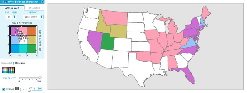
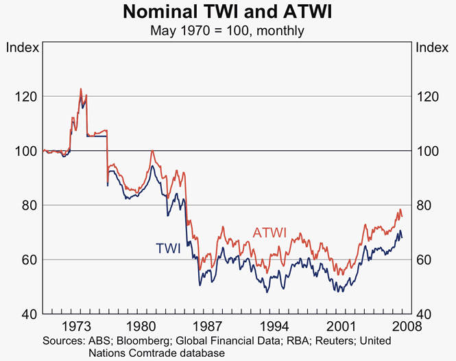
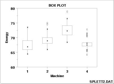
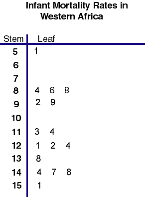
Classed choropleth maps use small increments to display the data. This map uses six classifications by color to show the death and birth rate in Australia.
Unclassed choropleth maps do not use keys to explain data or shading. This map shows the illiteracy rates throughout France. Not having a key makes it impossible to grasp the concept of this map.
Unstandardized choropleth maps show geographical areas that have been shaded in accordance to statistics. In this particular map, the areas are shaded based upon voting statistics from the 2004 Presidential race.
This type of map is made to show nominal data. The map shown is the percentage of people that are obese in Canada in 2005. This data comes from people aged 25-64.
This is another way of graphic multiple data in small amounts. This specific plot shows what farmers are raising animals and where those farm lands are.
Parallel coordinate graphs are used when there are different sources of data. This can range from two to however many you need. In this graph, the number of data sources is innumerable but it is still easy to read.
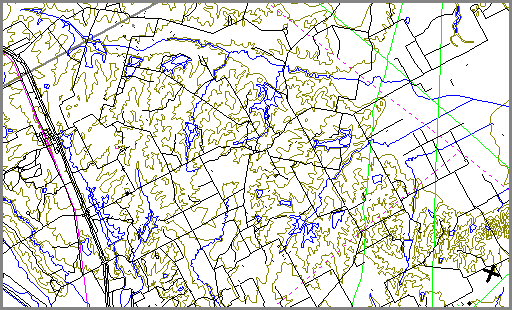
DOQQ maps stand for digital ortho quarter quad which uses the state plane system. This map is of Oklahoma 1995-1996. This is considered a type of topographic map.
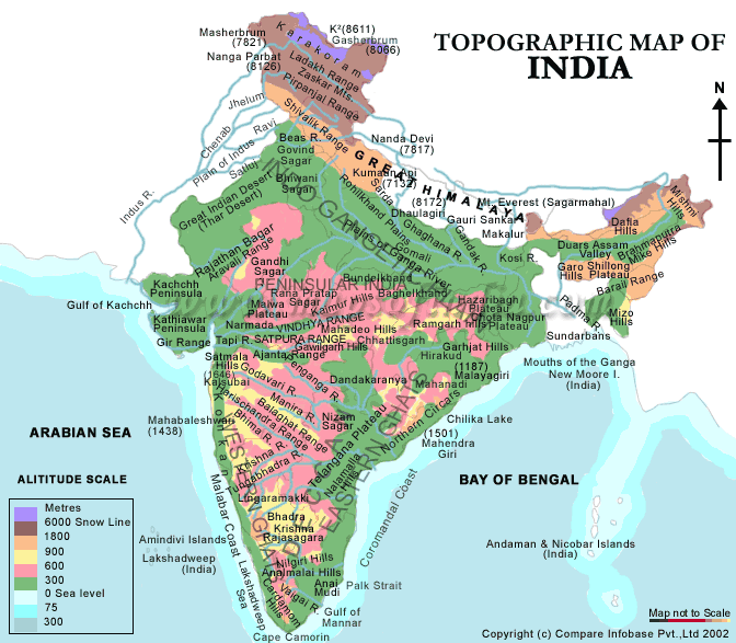
A topographic map stays true to its name sake and shows the topography of the mapped area. This specific map shows India. The different colors represent the height above sea level.
This type of map identifies elevation and terrain by colour. This specific map is of France. The olive green represents the lowest elevation where the light tan to brown hues represent the highest points.
This dot distribution map shows the population distribution through out the United States according to the 2000 U.S. census. The areas that are white signify what areas are most populated.
This map represents the Hispanic population in Florida according to the 2000 census. The map is broken up by county. Each color represents a certain percentage range which is laid out by the key in the left of the map.
This map shows how many people are online in countries in North Africa and the Middle East. This map is not up to date thought. These numbers reflect data from 2002.