Friday, December 10, 2010

Standard choropleth map


http://www.statcan.gc.ca/pub/92f0138m/2008003/figures/5200001-eng.htm

This map shows the percentage of Canada's population that is fourteen and under. It uses graded differences in color to indicate average values.

Univariate choropleth maps


http://www.gisdevelopment.net/application/urban/overview/urbano0032.htm

A univariate choropleth map displays a single data set. This map shows population growth in Burnside.

Range graded proportional circle map


http://www.neiu.edu/~ejhowens/377/examples.htm

A range graded proportional circle map uses circles to depict relations to ranges of data. In this map the data is divided up by state.

Classed choropleth map


http://www.eps.mq.edu.au/courses/GEOS219/choropleth.htm

Classed choropleth maps use small increments to display the data. This map uses six classifications by color to show the death and birth rate in Australia.

Unclassed choropleth map


http://math.yorku.ca/SCS/Gallery/milestone/thumb5/popup/bssn1_popup1-19.htm

Unclassed choropleth maps do not use keys to explain data or shading. This map shows the illiteracy rates throughout France. Not having a key makes it impossible to grasp the concept of this map.

Bivariate choropleth map


http://www.cartogrammar.com/blog/indiemapper-is-here/

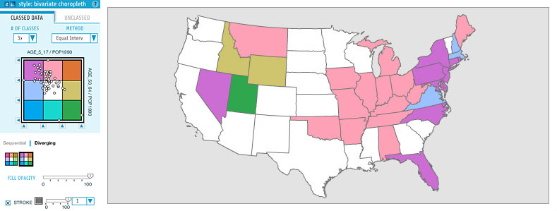
This is a picture of a Bivariate choropleth map in the making. A bivarate map uses colors to solve a problem of representation.

Unstandardized choropleth map


http://en.wikipedia.org/wiki/File:2004US_election_map.svg


Unstandardized choropleth maps show geographical areas that have been shaded in accordance to statistics. In this particular map, the areas are shaded based upon voting statistics from the 2004 Presidential race.

Continuously variable proportional circle map


https://www.e-education.psu.edu/geog486/l5_p5.html

The circles are used to express data. The map pictured is supposedly the oldest map of its kind.

Nominal area choropleth map


http://www.phac-aspc.gc.ca/publicat/cdic-mcc/30-1/ar_01-eng.php

This type of map is made to show nominal data. The map shown is the percentage of people that are obese in Canada in 2005. This data comes from people aged 25-64.

Accumulative line graph or Lorenz curve


http://www.answers.com/topic/lorenz-curve

The curved part of this graph is called the cumulative frequency curve. The curve occurs because of unequal distributions.

Bilateral Graph


http://www.rba.gov.au/publications/bulletin/2008/feb/1.html

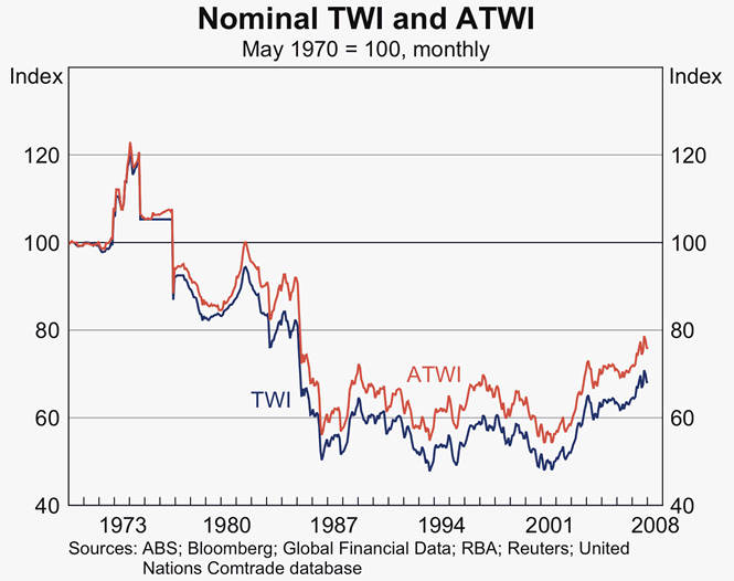
Bilateral graphs show two variables that tend to overlap. This specific map shows the trade rate of the Australian dollar.

Index Value Plot


http://ddo.typepad.com/

In index value plot shows the ratio of the value of all data. This particular plot is detailing the U.S. stock market rally.

Box Plot


http://www.itl.nist.gov/div898/handbook/eda/section3/boxplot.htm

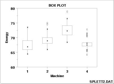
Box plots show variation changes in data sets. This box plot shows machine output and their effect on energy.

Stem and Leaf Plot


http://mainland.cctt.org/mathsummer/JosephBond/StemAndPlots/stem-and-leaf_std.htm

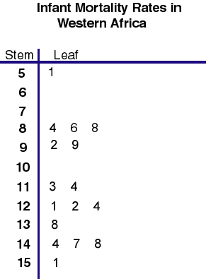
A stem and leaf plot presents quantitative data in a graphical format. This specific plot depicts the GNP for Africa per capita.

Similarity Matrix


http://www.biomedcentral.com/1471-2105/10/S11/S5/figure/F4?highres=y

A similarity matrix is a matrix of scores which share the same data points. This matrix is a heat map.

Correlation Matrix


http://www.livestockgenomics.csiro.au/Genome_to_Phenome/

This correlation matrix is a heat map of human body tissue. The thick lines navigate us through cancerous and non-cancerous tissues.

Star Plot


http://www.answers.com/topic/spider-plot

This is another way of graphic multiple data in small amounts. This specific plot shows what farmers are raising animals and where those farm lands are.

Scatterplot


http://ops.fhwa.dot.gov/congestion_report/chapter3.htm

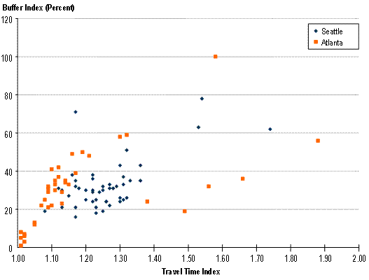
The scatter plot is a way of showing a group of data from different sources. This map is comparing commute times in Atlanta and Seattle.

Patallel Coordinate Graph


http://vis.lbl.gov/Vignettes/Drosophila/index.html

Parallel coordinate graphs are used when there are different sources of data. This can range from two to however many you need. In this graph, the number of data sources is innumerable but it is still easy to read.

DOQQ Map


http://www.topographic.com/datasamples.htm

DOQQ maps stand for digital ortho quarter quad which uses the state plane system. This map is of Oklahoma 1995-1996. This is considered a type of topographic map.

DEM Map


http://www.superstition-sar.org/maps.htm


A DEM is also known as a digital elevation model. This specific map shows the elevation of an area in Arizona quite frequently traversed by hikers.

Climograph Map


http://tropicalphotofy.com/q/climograph+of+tropical+weathers/

This map shows the different climates throughout the world. The different types of climates are represented by a different color.

DLG Map


http://barthelmy.com/consulting/projects/proj_custom_data_MidContinent.htm

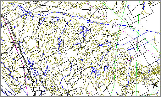
A DLG map is a digital line graphic. This data can include parks, public land section lines, roads, trails, and railroads, etc.

DRG Map


http://egsc.usgs.gov/isb/pubs/factsheets/fs08801.html

DRG stands for digital raster graphic. It is a scanned image of a U.S. Geological Survey topographic map. This one is of Washington D.C.

Isopleth Map


http://wattsupwiththat.com/2008/06/26/color-and-temperature-perception-is-everything/

Isopleth maps are used prominently in weather forecasts. The one shown gives the surface temperature based upon a key.

Isopach Map


http://www.geo.utexas.edu/faculty/barker/kempter/rbtephra.html

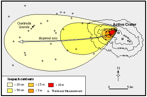
This isopach map shows an underwater volcano. This show the deposits that were as a result of the eruption.

Thursday, December 9, 2010

Isohyet map


http://www.trc.govt.nz/previous-month-and-year-to-date/

This isohyet map depicts the amount of rainfall from January to November of 2010.

Isotach Map


http://www.puttingzone.com/MyTips/wind.html

This is a map of Canada showing the highest wind speeds in the last fifty years. Isotaches are wind speed lines which are shown clearly on this map.

PLSS Map


http://www.rootsweb.ancestry.com/~alfrankl/landrecords.htm

This PLSS map shows all the townships within Alabama. The blue section is highlighting Franklin County.

Topographic Map


http://www.mapsofindia.com/maps/india/map-of-india-physical.gif

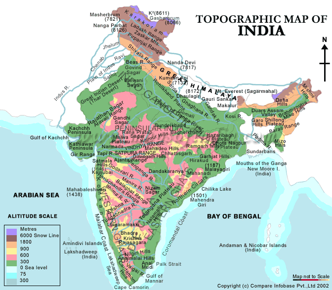
A topographic map stays true to its name sake and shows the topography of the mapped area. This specific map shows India. The different colors represent the height above sea level.

Hypsometric map


http://www.reliefshading.com/colors/hypsometric.html

This type of map identifies elevation and terrain by colour. This specific map is of France. The olive green represents the lowest elevation where the light tan to brown hues represent the highest points.

Cadastral Map


http://www.spaceage.co.in/cadastral-surveys.php

Cadastral maps show land parcels and define the location, shape and size of said parcels. This particular map shows land value, ownership and use.

Wednesday, December 8, 2010

Dot Distribution Map


http://www.census.gov/geo/www/mapGallery/2kpopden.html

This dot distribution map shows the population distribution through out the United States according to the 2000 U.S. census. The areas that are white signify what areas are most populated.

Choropleth Map


http://my.ilstu.edu/~jrcarter/Geo204/Choro/Tom/

This map represents the Hispanic population in Florida according to the 2000 census. The map is broken up by county. Each color represents a certain percentage range which is laid out by the key in the left of the map.

Statistical Map


This map shows how many people are online in countries in North Africa and the Middle East. This map is not up to date thought. These numbers reflect data from 2002.

Tuesday, September 7, 2010

Flow Map


http://www.mundi.net/maps/maps_014/

This map depicts the use of telecommunication traffic in Europe. The thicker the line, the more traffic annually. The entire map is measured in millions of minutes of voice telecommunication.

Black and White Aerial Photo


http://www.loc.gov/exhibits/911/911-maps.html


This map is a black and white aerial photo. While not a "typical" map, it is still very clear where buildings and streets are. This is another mapping technique that helped with the recovery efforts of 9/11. This map shows lower Manhattan.

Monday, September 6, 2010

LIDAR


http://www.loc.gov/exhibits/911/911-maps.html

This map shows the elevations of the World Trade Center and surrounding area in July of 2001. Of my research on maps, this was, by far, the most interesting. This map was grouped with other LIDAR maps of the area as well that I am going to include.


The map above was taken on September 15th 2001.


The above map was done on September 17th 2001.

The website I took these maps from said they used LIDAR to "provided elevation data of the Ground Zero site. It enabled emergency managers to assess damage through the smoke. The LIDAR data was used to determine changes in the rubble pile and to create 3-D digital elevation models that demonstrated the extent of the destruction."

(I found this very interesting. The quote comes directly from the website previously cited under the first image.)

Mental Map


http://soa.utexas.edu/work/eaejp/methods.htm

A mental map is a person point of view perception of their personal world. This mental map just so happens to be from a sixth grader. His assignment was to draw a map for the route he takes two and from school. With mental maps, distortion is assumed, especially when it is from the mind of a sixth grader.

Proportional Circle Map


http://tsun.sscc.ru/hiwg/data.htm

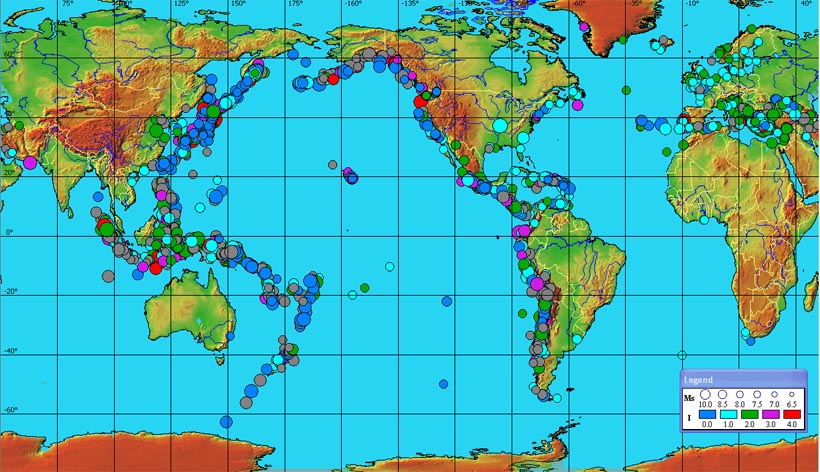
This map shows where tsunamis historically occur. The time frame is 1628 B.C. to the present day. The size of the dot correlates to the magnitude of the tsunami, where the color correlates to the intensity.

Thematic Map


http://soils.usda.gov/use/thematic/moist_regimes.html

This map has one theme and that is the different types of soil through out the U.S. and how much moisture they contain. The colors represent the nine different soil types which are told to us in the key.

Cartographic Animation


http://geography.uoregon.edu/envchange/clim_animations/gifs/tmp2m_web.gif

This map shows the air temperature through out the world. It is always changing because it is keeping up with what it is like currently. The key tells us what range of temperature is aligned what color. The temperature is degrees Celsius.

Isoline Map


This map shows the surface dew point temperature of the United States in degrees Fahrenheit. It also shows parts of Mexico and Canada. The map outlines every state to make it easier to read. The key at the bottom lists the temperature range for every color displayed on the map.

Triangle Plot


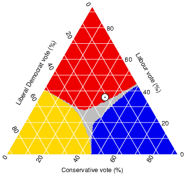
This triangle plot shows many things about the 2005 elections in the U.K. The white dot shows where voters opinions stood at the time of the opinion survey. The outcome could change drastically due to voter showing.

Isobar


This map shows that there are at least two high pressure systems coming in from the north. It also shows that there are a few small pressure systems with a fairly major one coming from the north-west.

Histogram


This histogram is very different than most. It shows a plain map of the United States with the histogram popping out in a 3D manner. The red bars coming out of the map show where there is the most delays in traffic are per year. The reader of the map must already have a general understanding of U.S. map in order to know what cities and states the map is portraying.

Population Density


This map shows the population density of the state of Texas according to the U.S. Census Bureau in 2000. This map also designates where the county lines are so that readers can see the density of each county separately. This map shows that most people live in East Texas.

Windrose


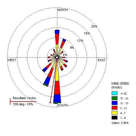
This map shows that in Seattle on this day, the wind did not blow over 21 knots in any direction. Throughout the day, it blew the strongest to the South/South-west. The wind did not blow under seven knots.