Tuesday, September 7, 2010

Flow Map


http://www.mundi.net/maps/maps_014/

This map depicts the use of telecommunication traffic in Europe. The thicker the line, the more traffic annually. The entire map is measured in millions of minutes of voice telecommunication.

Black and White Aerial Photo


http://www.loc.gov/exhibits/911/911-maps.html


This map is a black and white aerial photo. While not a "typical" map, it is still very clear where buildings and streets are. This is another mapping technique that helped with the recovery efforts of 9/11. This map shows lower Manhattan.

Monday, September 6, 2010

LIDAR


http://www.loc.gov/exhibits/911/911-maps.html

This map shows the elevations of the World Trade Center and surrounding area in July of 2001. Of my research on maps, this was, by far, the most interesting. This map was grouped with other LIDAR maps of the area as well that I am going to include.


The map above was taken on September 15th 2001.


The above map was done on September 17th 2001.

The website I took these maps from said they used LIDAR to "provided elevation data of the Ground Zero site. It enabled emergency managers to assess damage through the smoke. The LIDAR data was used to determine changes in the rubble pile and to create 3-D digital elevation models that demonstrated the extent of the destruction."

(I found this very interesting. The quote comes directly from the website previously cited under the first image.)

Mental Map


http://soa.utexas.edu/work/eaejp/methods.htm

A mental map is a person point of view perception of their personal world. This mental map just so happens to be from a sixth grader. His assignment was to draw a map for the route he takes two and from school. With mental maps, distortion is assumed, especially when it is from the mind of a sixth grader.

Proportional Circle Map


http://tsun.sscc.ru/hiwg/data.htm

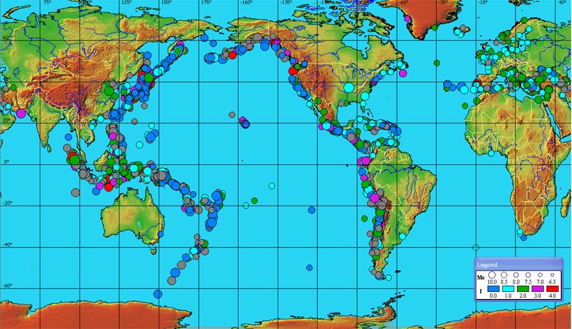
This map shows where tsunamis historically occur. The time frame is 1628 B.C. to the present day. The size of the dot correlates to the magnitude of the tsunami, where the color correlates to the intensity.

Thematic Map


http://soils.usda.gov/use/thematic/moist_regimes.html

This map has one theme and that is the different types of soil through out the U.S. and how much moisture they contain. The colors represent the nine different soil types which are told to us in the key.

Cartographic Animation


http://geography.uoregon.edu/envchange/clim_animations/gifs/tmp2m_web.gif

This map shows the air temperature through out the world. It is always changing because it is keeping up with what it is like currently. The key tells us what range of temperature is aligned what color. The temperature is degrees Celsius.

Isoline Map


This map shows the surface dew point temperature of the United States in degrees Fahrenheit. It also shows parts of Mexico and Canada. The map outlines every state to make it easier to read. The key at the bottom lists the temperature range for every color displayed on the map.

Triangle Plot


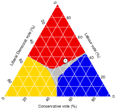
This triangle plot shows many things about the 2005 elections in the U.K. The white dot shows where voters opinions stood at the time of the opinion survey. The outcome could change drastically due to voter showing.

Isobar


This map shows that there are at least two high pressure systems coming in from the north. It also shows that there are a few small pressure systems with a fairly major one coming from the north-west.

Histogram


This histogram is very different than most. It shows a plain map of the United States with the histogram popping out in a 3D manner. The red bars coming out of the map show where there is the most delays in traffic are per year. The reader of the map must already have a general understanding of U.S. map in order to know what cities and states the map is portraying.

Population Density


This map shows the population density of the state of Texas according to the U.S. Census Bureau in 2000. This map also designates where the county lines are so that readers can see the density of each county separately. This map shows that most people live in East Texas.

Windrose


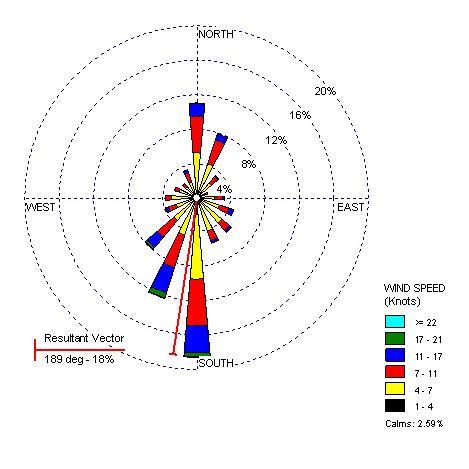
This map shows that in Seattle on this day, the wind did not blow over 21 knots in any direction. Throughout the day, it blew the strongest to the South/South-west. The wind did not blow under seven knots.

Doppler Radar


This map shows that there is a large storm crossing over Nebraska, Iowa, Illinois, Kansas and Oklahoma. People in the surrounding area are experiencing or will be experiencing light to moderate rainfall.

Cartogram


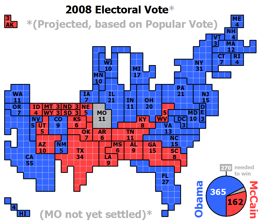
This map shows the projected electoral votes for each state in the 2008 election between Obama and McCain. The red colored states represent the states that will have the majority vote for McCain (the Republican candidate)and the blue states represent the states whose electoral votes will go towards Obama (the Democratic candidate.) It shows that Montana is not yet settled. In the corner it shows a pie diagram showing that it is currently projected that Obama will win over McCain.

Propaganda Map


This map was made to show Europe at the brink of World War I. It depicts who is fighting whom and gives the map reader a hint at who the victors might be in the end.

Infrared Aerial Photo


This is an aerial photograph of th Netley-Libau Marsh in Manitoba, Canada that was taken in 2001. This photograph shows a significant color change between where the marsh is and where the land is.